Today, Jakub Steiner from the GNOME design team is going to talk about Adwaita, the default theme for GTK+; the tools that the designers can use to style GTK+; and how the toolkit changed to allow a better design workflow.
Adwaita is the user facing façade of GTK+. In the past GTK+ had no face; there was no properly defined look for the toolkit. Like many things in the FOSS world, it was a bring your own. There was Raleigh, a fallback skin that only showed up if something went sideways with theming or the system settings. And you didn’t really want to see that.
CSS
With GTK+ 3.0 a bold new effort has started. An effort to put visual designers in charge of visual design, using tools they understand. Instead of resorting to theme engines to draw unique controls, a styling engine used on the web has been chosen. The “everything is a box” CSS model applied to GTK+ rather well. It took a lot of effort, mainly on the shoulders of Benjamin Otte, who over the years managed to give us what we dreamed of: a CSS-like box model, allowing us to space elements/controls using padding, margins, borders and nifty features like minimum width. On the selector side, we aren’t dealing with the direct nested widget structure that changes from release to release, but we were given an abstracted, HTML-like DOM structure, with nodes and classes. Nodes are also consistently carrying state and are easier to animate.
SCSS
In GTK+ there are a lot of controls that look like a button but aren’t a button. Every programmer is on the lazy side, and that’s a good thing. Designers aren’t any different. It’s so positive that there is an acronym for it, DRY — don’t repeat yourself. So in the old Adwaita, when we designed the look of some things that all looked the same, we only had one block of properties and a ton of selectors — the targets of that look. Buttons, dropdowns, you name it. Not much typing, but insanity to alter.
SASS came to the rescue by providing means to define a common drawing procedure once, but reuse it in a well structured stylesheet. You would be able to draw things “like a button” but not define it as a button. You would still find a dropdown nicely semantically organized in a dropdown section. SASS calls these macros mixins and you will find our drawing ones in src/gtk/theme/Adwaita/_drawing.scss.
/* Switch Slider being a button */
slider {
/* ... */
@include button(normal, $edge: $shadow_color);
}
Inspector
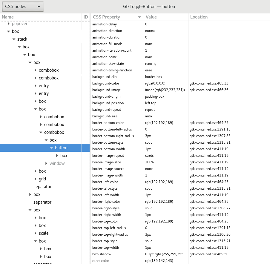
A massive improvement for the designer’s workflow has been the introduction of the Inspector. The inspector is an invaluable tool to test out new style interactively or to figure out why a particular selector isn’t working. There are a couple of powerful tools it provides:
- Widget selector. You can interactively point at a widget to learn about its properties or where it lives in the widget tree stack. Since 3.20 you can also learn about its CSS nodes, learn what sort of states it can get to, learn all the classes it has been assigned. It can also tell you where in the stylesheet the set property has been defined. This helps you figure out why your selector isn’t working. Somewhat. It would be real nice to see all matching selectors, even those that have been overriden by those that take precedence.
- Interactive CSS stylesheet. You can write a CSS rule and have it applied in real time. This is not only useful to figure out a proper selector, but also experiment with drawing using GTK+ directly rather than using tools like Inkscape. Being able to iterate fast and try out things results in better design.
If this all sounds very similar to what modern browsers provide, it’s not much of a coincidence.
Future Improvements
A major factor that’s making us less flexible in terms of being able to alter Adwaita are the graphic assets. There are still a couple of things that we have to resort to using image assets for. Those are actually in a large asset sheet SVG and we have a bunch of scripts to chop up multiple sized images (for HiDPI). It remains a hassle to add or change a particular bit.
To make this a little less boring, here’s a little web demo of how we could possibly avoid using image assets to draw GtkScale sliders and use simple CSS boxes instead:
<div id="scale" class="scale">
  <div class="trough"></div>
  <div id="slider" class="slider run-animation"></div>
</div>

<style type="text/css">
.scale {
  position: relative;
  width: 100%;
  height: 64px;
}
.scale:hover { }
.trough {
  position: absolute;
  top: 50%;
  transform: translateY(-50%);
  height: 8px;
  border-style: solid;
  border-width: 2px;
  border-radius: 4px;
  left: 0; right: 0;
  border-color: #a7a7a7;
  background-color: #b1b3b1;
  background-image: linear-gradient(to bottom, #a7a7a7, #bebebe);
  box-shadow: 0 1px 0 rgba(255,255,255,0.8);
}
.slider {
  position: absolute;
  width: 48px; height: 48px;
  top: 50%;
  left: 0%;
  transform: translateY(-50%) translateX(0%) rotate(0deg);
  border-style: solid;
  border-width: 2px;
  border-color: #a7a7a7;
  border-radius: 0;
  background-color: #e0e0e0;
  background-image: linear-gradient(135deg, #ededed, #d3d3d3);
  box-shadow: inset 0 0 0 2px rgba(255,255,255,0.2),
              2px 2px 2px rgba(0,0,0,0.1);
}
.slider.run-animation {
  animation-name: morph, progress;
  animation-delay: 6s,10s;
  animation-duration: 3s,3s;
  animation-iteration-count:1,infinite;
  animation-direction: normal, alternate;
  animation-timing-function: ease-in-out;
  animation-fill-mode: forwards;
}
.slider.run-animation:hover {
  /* the best way to reset CSS animations is switching between identical keyframes */
  animation-name: morphClone, progressClone;
}
@keyframes morph {
  0% {
    border-radius: 0;
    transform: translateY(-50%) translateX(0%) rotate(0deg);
  }
  90% {
    border-radius: 50% 50% 0 50%;
    transform: translateY(-50%) translateX(0%) rotate(0deg);
  }
  100% {
    border-radius: 50% 50% 0 50%;
    transform: translateY(-60%) translateX(0%) rotate(45deg);
  }
}
@keyframes morphClone {
  0% {
    border-radius: 0;
    transform: translateY(-50%) translateX(0%) rotate(0deg);
  }
  90% {
    border-radius: 50% 50% 0 50%;
    transform: translateY(-50%) translateX(0%) rotate(0deg);
  }
  100% {
    border-radius: 50% 50% 0 50%;
    transform: translateY(-60%) translateX(0%) rotate(45deg);
  }
}
@keyframes progress {
  0% {
    left: 0%;
    transform: translateY(-60%) translateX(0%) rotate(45deg);
  }
  100% {
    left: 100%;
    transform: translateY(-60%) translateX(-100%) rotate(45deg);
  }
}
@keyframes progressClone {
  0% {
    left: 0%;
    transform: translateY(-60%) translateX(0%) rotate(45deg);
  }
  100% {
    left: 100%;
    transform: translateY(-60%) translateX(-100%) rotate(45deg);
  }
}
</style>
Essentially the slider is a box with 3 corners rounded and rotated by 45 degrees. All we need is boxes.
    /* transforms-based scale slider on the web */
.slider {
  position: absolute;
  width: 48px; height: 48px;
  top: 50%;
  left: 0%;
  /* move up slightly after rotation, thus not 50% */
  transform: translateY(-60%) rotate(45deg);
  border-style: solid;
  border-width: 2px;
  border-color: #a7a7a7;
  border-radius: 50% 50% 0 50%;
  background-color: #e0e0e0;
  background-image: linear-gradient(135deg, #ededed, #d3d3d3);
  box-shadow: inset 0 0 0 2px rgba(255,255,255,0.2),
              2px 2px 2px rgba(0,0,0,0.1);
}
btw, where from can we find a gtk3 theme looking like Motif? (or even better, like the Motif used on SunOS or Irix-4dwm?)
No idea, sorry. You may check on GNOME Looks.