Adwaita has been the default GTK+ theme for quite a while now (on all platforms). It has served us well, but Adwaita hasn’t seen major updates in some time, and there is a desire to give it a refresh.
Updating Adwaita is a challenge, since most GTK applications are using the stable 3.x series, and some of them include Adwaita-compatible theming for their own custom widgets. Given the stable nature of this release series, we don’t want to cause theme compatibility issues for applications. At the same time, 3.x is the main GTK version in use today, and we want to ensure that GTK applications don’t feel stale or old fashioned.
A trial
A number of approaches to this problem have been considered and discussed. Out of these, a tentative plan has been put forward to trial a limited set of theme changes, with the possibility of including them in a future GTK 3 release.
Our hope is that, due to the limited nature of the theme changes, they shouldn’t cause issues for applications. However, we don’t want to put our faith in hope alone. Therefore, the next three weeks are being designated as a testing and consultation period, and if things go well, we hope to merge the theme into the GTK 3.24.4 release.
It should be emphasised that these changes are confined to Adwaita itself. GTK’s CSS selectors and classes have not been changed since GTK 3.22, and the changes in Adwaita won’t impact other GTK themes.
The Adwaita updated theme is being made available as a separate tarball in parallel with the GTK 3.24.3 release, and can be downloaded here. GTK application developers are invited to try 3.24.3 along with the new version of Adwaita, and report any issues that they encounter. The GTK team and Adwaita authors will also be conducting their own tests. Details of how to test the new theme in various ways are described here.
We are hoping to strike a balance between GTK’s stability promises on the one hand, and the desire to provide up-to-date applications on the other. It is a delicate balance to get right and we are keen to engage with GTK users as part of this process!
Theme changes
The rest of this post summarises which changes are have been made to the theme. This will hopefully demonstrate the limited extent of these changes. It will also help developers know what to look for when testing.
Colors
Many of the Adwaita colors have been very slightly tweaked. The new colors are more vivid than the previous versions, and so give Adwaita more energy and vibrancy. The new colors also form part of a more extensive palette, which is being used for application icons. These colours can also be used in custom application styling.
The color changes are subtle, so any compatibility issues between the new and the old versions should not be serious. Blue is still blue (just a slightly different shade!) Red is still red. Visually, the dark and light versions of the theme remain largely the same.
Adwaita’s dark variant, showing the slight color changes between old (left) and new (right).
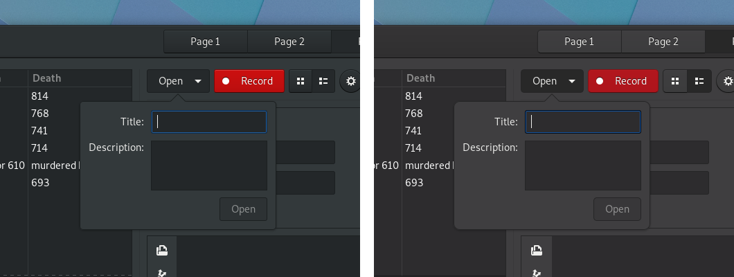 Note that the red of the button has been toned down a bit in the dark theme.
Header bars and buttons
Most widgets have not been specifically changed in the updated version of Adwaita. However, two places where there are widget-specific changes are header bars and buttons. In both cases, an effort has been made to be lighter and more elegant.
Buttons have had their solid borders replaced with shadows. Their background is also flatter and their corners are more rounded. Their shape has also been changed very slightly.
Header bars have been updated to complement the button changes. This has primarily been done by darkening their background, in order to give buttons sufficient contrast. The contrast between header bars’ focused and unfocused states has also been increased. This makes it easier for users to identify the focused window.
At first glance, these changes are some of the most significant, but they are achieved with some quite minor code changes.
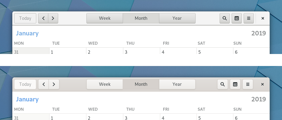
The header bar in GNOME’s Calendar app (old version on top, new version on the bottom):
Switches
Aside from header bars and buttons, the only other widget to be changed is switches. When GTK first introduced switches, they were a fairly new concept on the desktop. For this reason, they included explicit “ON” and “OFF” labels, in order to communicate how the switches operated. Since then, switch widgets have become ubiquitous, and users have become familiar with switches that don’t contain labels.
The latest Adwaita changes bring the theme into line with other platforms and make switches more compact and modern in appearance, by removing the labels and introducing a more rounded shape.
Elsewhere, no change
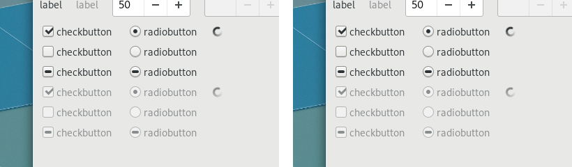
Aside from the changes described above, very little has changed in Adwaita. The vast majority of widgets remain the same, albeit with very slightly altered colours. Generally, UI layouts shouldn’t alter and users should feel comfortable with the changes.
Spot the difference (the old version of Adwaita is on the left and the new version is on the right):
Conclusion
Please try the new theme. We hope you like it!
And we appreciate your feedback—in particular if you are a GTK application developer. You can provide it on irc (in the #gtk+ channel on GimpNet) or via the gtk-devel-list mailing list, or by filing an issue in gitlab.