Adwaita has been the default GTK+ theme for quite a while now (on all platforms). It has served us well, but Adwaita hasn’t seen major updates in some time, and there is a desire to give it a refresh.
Updating Adwaita is a challenge, since most GTK applications are using the stable 3.x series, and some of them include Adwaita-compatible theming for their own custom widgets. Given the stable nature of this release series, we don’t want to cause theme compatibility issues for applications. At the same time, 3.x is the main GTK version in use today, and we want to ensure that GTK applications don’t feel stale or old fashioned.
A trial
A number of approaches to this problem have been considered and discussed. Out of these, a tentative plan has been put forward to trial a limited set of theme changes, with the possibility of including them in a future GTK 3 release.
Our hope is that, due to the limited nature of the theme changes, they shouldn’t cause issues for applications. However, we don’t want to put our faith in hope alone. Therefore, the next three weeks are being designated as a testing and consultation period, and if things go well, we hope to merge the theme into the GTK 3.24.4 release.
It should be emphasised that these changes are confined to Adwaita itself. GTK’s CSS selectors and classes have not been changed since GTK 3.22, and the changes in Adwaita won’t impact other GTK themes.
The Adwaita updated theme is being made available as a separate tarball in parallel with the GTK 3.24.3 release, and can be downloaded here. GTK application developers are invited to try 3.24.3 along with the new version of Adwaita, and report any issues that they encounter. The GTK team and Adwaita authors will also be conducting their own tests. Details of how to test the new theme in various ways are described here.
We are hoping to strike a balance between GTK’s stability promises on the one hand, and the desire to provide up-to-date applications on the other. It is a delicate balance to get right and we are keen to engage with GTK users as part of this process!
Theme changes
The rest of this post summarises which changes are have been made to the theme. This will hopefully demonstrate the limited extent of these changes. It will also help developers know what to look for when testing.
Colors
Many of the Adwaita colors have been very slightly tweaked. The new colors are more vivid than the previous versions, and so give Adwaita more energy and vibrancy. The new colors also form part of a more extensive palette, which is being used for application icons. These colours can also be used in custom application styling.
The color changes are subtle, so any compatibility issues between the new and the old versions should not be serious. Blue is still blue (just a slightly different shade!) Red is still red. Visually, the dark and light versions of the theme remain largely the same.
Adwaita’s dark variant, showing the slight color changes between old (left) and new (right).
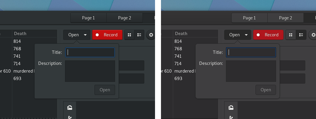 Note that the red of the button has been toned down a bit in the dark theme.
Header bars and buttons
Most widgets have not been specifically changed in the updated version of Adwaita. However, two places where there are widget-specific changes are header bars and buttons. In both cases, an effort has been made to be lighter and more elegant.
Buttons have had their solid borders replaced with shadows. Their background is also flatter and their corners are more rounded. Their shape has also been changed very slightly.
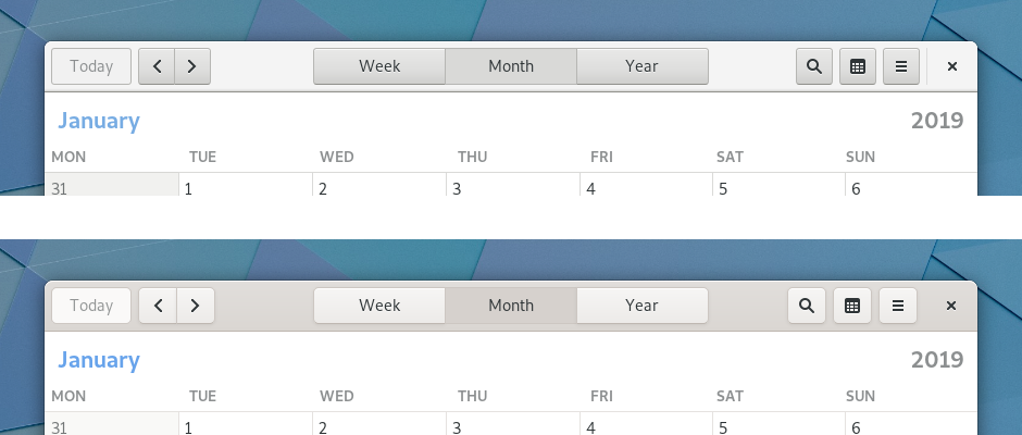
Header bars have been updated to complement the button changes. This has primarily been done by darkening their background, in order to give buttons sufficient contrast. The contrast between header bars’ focused and unfocused states has also been increased. This makes it easier for users to identify the focused window.
At first glance, these changes are some of the most significant, but they are achieved with some quite minor code changes.
The header bar in GNOME’s Calendar app (old version on top, new version on the bottom):
Switches
Aside from header bars and buttons, the only other widget to be changed is switches. When GTK first introduced switches, they were a fairly new concept on the desktop. For this reason, they included explicit “ON” and “OFF” labels, in order to communicate how the switches operated. Since then, switch widgets have become ubiquitous, and users have become familiar with switches that don’t contain labels.
The latest Adwaita changes bring the theme into line with other platforms and make switches more compact and modern in appearance, by removing the labels and introducing a more rounded shape.
Elsewhere, no change
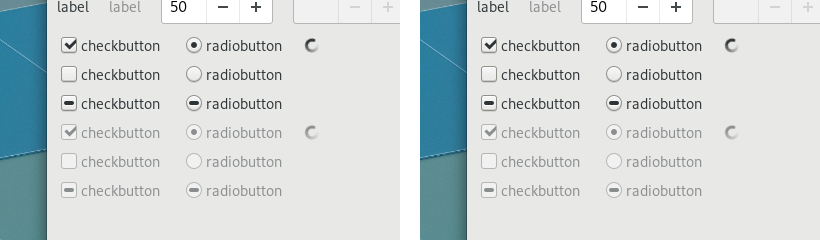
Aside from the changes described above, very little has changed in Adwaita. The vast majority of widgets remain the same, albeit with very slightly altered colours. Generally, UI layouts shouldn’t alter and users should feel comfortable with the changes.
Spot the difference (the old version of Adwaita is on the left and the new version is on the right):
Conclusion
Please try the new theme. We hope you like it!
And we appreciate your feedback—in particular if you are a GTK application developer. You can provide it on irc (in the #gtk+ channel on GimpNet) or via the gtk-devel-list mailing list, or by filing an issue in gitlab.
I’m not sure if I properly caught this on the toggle-switches, but is that vertical line, in place of the ‘ON’ text, a ‘1’? If so, and if it’s matched by a ‘0’ for the off position, my feedback would be that it’s visual noise. Hypothetically, my mother will understand the toggle because of the background (blue/gray) and location of the toggle control (right/ left), but won’t realize she’s also looking at the 1/0 symbols unless it’s pointed out. Until then, they would only distract from her intuition based on those other indicators, which match her expectations set by other recent platforms.
If that’s not a 1/0 symbol, my bad, but I’d still second the alternative suggested above: use check-box style “check mark”/X symbols instead. Those don’t need to be translated, unlike “ON”/”OFF”, and still provide an accessible, visible difference in addition to the color contrast and toggle location.
Like new theme. The only thing i still wish is less brighter text on Adwaita-dark variant because it creates some kind of glow effect. Harder to read and cause eyes strain. Big contrast in color brightness. The same goes for icon theme with dark variant gtk theme.
https://uxmovement.com/content/why-you-should-never-use-pure-black-for-text-or-backgrounds/
The symbol is
U+23FD POWER ON SYMBOL
But not many fonts have that, so you’re likely to see the fallback
U+2759 MEDIUM VERTICAL BAR
I really like the theme changes!
But how does one use the colors of the theme for custom application styling?
For example, if I want to use the Adwaita kind of green for custom rendering via cairo.
I agree with Josh that the power symbol in the toggle switch is odd. I don’t think any symbol is needed. Plenty of existing mobile/desktop interfaces just go with the horizontal pill shape + circle slider. Colored background when enabled, non-colored when off. I think a high percentage of users need no more indication than that. The symbols are more likely to just confuse users since other interfaces don’t have them. If anything a checkmark seems to be the most standard when a symbol is used.
I have used it for some time now and I have to say it is not so bad after all. Still prefer the old Adwaita but not so terrible to use like in the beginning.
Crucify me, my maners make me deserve it.
[WORDPRESS HASHCASH] The poster sent us ‘0 which is not a hashcash value.
I am not a developer but I install at least 3 themes a week into Arch Xfce but for some reason this theme doesn’t even show up in my settings after placing the extracted them into the folder.
I am an application developer, and here are my constructive comments / observations…
(1)
The tabs in GtkNotebook have no border. The only way to distinguish is a tab is selected is by the blue underline. This is probably a bug that should be fixed before the new theme is released. You can see this issue in the file properties dialog in Nautilus.
(2)
Andrey Sh’s comment on January 15 about the saturation for the grays is a good point: The current NewAdwaita shades are a little too “warm”. When you browse through the “before” and “after” pictures she linked to in her post, you can see the difference. (Perhaps the current grays chosen for NewAdwaita may provide better contrast on a wider range of monitors? Please let us know?).
(3)
Regarding the “OFF” text in the switches, the last “F” is cut-off by the right-side border of the switch, and the “O” touches the edge of the round switch. It would be nice if there were more padding around this text. The “ON” text has very good padding, since it is only two characters wide.
Because the switch must to be twice as wide as its round button, the solution is not as easy as stretching the switch to increasing the left-and-right padding of the “ON” and “OFF” text– the roud button would stretch into an oval, or the switch would have too much gap in the center between the on and off positions.
Automatically using a narrow font may be an option, but not all fonts have a narrow variant.
Ultimately, a good compromise may be to use a smaller font size for the “ON” and “OFF” text in the switches, to give them a more professional and elegant appearance.
A final option: perhaps create rounded-rectangular switches using the same radius as other UI elements such as buttons? THe button inside the switch would be a matching rounded square shape. This would offer consistency, create a unified look for NewAdwaita, while providing enough space for the “OFF” text inside the switches.
(4)
fthx’s comment on January 15th and “someone’s” comment on January 16th about the folder button touching the slash in the Nautilus header path-bar is a good points. Perhaps the slashes should be replaced by a graphical element (like a chevron — a very tall “greater-than symbol”; in other words, a stretched and thinner version of “>” — it would take the same amount of horizontal space s the “/” without touching the folder buttons).
Per “someone’s” comment on January 16th, the Nautilus background should not change when the view is changed (from list view to thumbnails view).
(5)
I disagree with others’ comments about the calendar buttons. It is clear to me that these three buttons are a part of a group, because they all touch each other. Also, the buttons on the left and right have rounded corners, visually creating a rounded rectangle border for the entire group of three buttons. It is also clear that the Month button in this group is already pressed, while the Week and Year buttons may still be selected.
(6)
Question: GTK2 Apps are not rendered using NewAdwaita theme, so they look out of place. However GTK2 apps look fine using the current Adwaita theme. What will happen with GTK2 apps when NewAdwaita is released? Is there a way to get consistent look & feel with NewAdwaita?
Hello,
On iOS, the 1/0 symbols can be added as an accessibility feature on on/off switch, and it’s quite important if you cannot see blue for example.
I’m using gtk 3.24.5, and the new buttons seems to be blue only, without the 1/0.
Would it be possible to give the possibility to re-activate this option under “Universal Access” under the “Seeing” section? :(
hi
i’ve been using this for a while and i really hated it. mostly about the contrast between header bars and buttons.
is there any way to bring back the old one ? i appreciate if u could help me.
@aRman NM: You can check out an older version of GTK 3.24 from Git, extract the Adwaita CSS, and put them into your own separate theme.