Versioning and long term stability promise in GTK+

The plans set out in this post supersede those that were publicised after the Toronto GTK+ hackfest in June 2016.

This month, the GTK+ team will publish the first in a series of long-term stable releases. This will make GTK+ more predictable and reliable, while not inhibiting future GTK+ improvements.

These plans are a result of discussions held with a variety of stakeholders since initial plans were made at the GTK+ hackfest in Toronto last June.

Background

GTK+ has followed a fairly straightforward versioning scheme since the 2.0 release in 2002:

  • major versions designate the general API version
  • minor versions designate development cycles (if odd) and stable cycles (if even)
  • micro versions designate bug fix updates

Any API introduced in GTK+ is guaranteed to exist until the next major version; API introduced during a development cycle is guaranteed to remain once the stable cycle begins. Stable cycles do not provide new features or new API.

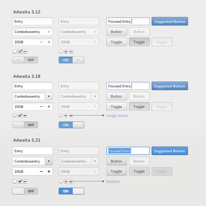
This scheme served us well, but its problems have become increasingly clear during the 3.x series, especially when coupled with 6 month, time-based development cycles. During the 2.x cycle new features in GNOME applications were forced to appear in additional libraries because the toolkit was too complex or moving too slowly. Since 3.0, the development pace of GTK+ has been picking up. GTK+ has been placed front and center, with new widgets and new functionality being introduced every six months. In order to implement these new widgets and functionality, though, some of the toolkit’s internals have been in a state of flux.

From a GNOME perspective, GTK+ has been a reasonably stable, albeit moving target, because GNOME developers and GTK+ developers can share feedback and proposals and quickly keep up with internal changes. From the perspective of the community, on the other hand, following GTK+ development has been more painful. Application developers outside of the GNOME project have had a hard time finding out about what changes in the toolkit will impact their codebases. The GTK+ team has attempted to improve its communication channels, but blogging about changes during development cycles hasn’t been enough for many in the wider community of GTK+ users.

Long-term stable GTK+ releases

GTK+ has three primary stakeholders: application developers who want feature and API stable releases; desktop developers who want access to development versions of GTK+ in order to introduce new functionality at a rapid pace (this includes most of the GNOME project); and the GTK+ team itself, which needs the ability to iterate on the internals of the library during longer development cycles.

The introduction of long-term stable GTK+ releases is designed to ensure that GTK+ strikes a good balance between each of these audiences. In particular, application developers will have access to a stable platform which nonetheless provides access to new GTK+ features that have been developed during the 3.x series, such as CSS styling, touchscreen support, HiDPI displays support, Wayland support, new widgets, the GTK+ inspector, and more.

GTK+ will continue to publish major, minor and micro releases. New major versions will be released once new features have stabilised, which is expected to be roughly every 2-3 years. When bumping to a new major version deprecated API will be removed. After that, this API series will be considered stable. New minor releases may introduce new widgets, or update the implementation of windowing system protocols in the GDK backends, but no additional features or theme changes will be allowed. Whereas previously minor releases were published every six months, now they will be produced as and when necessary. We’ll also keep doing micro releases for bug fixes and security issues, for at least three years. Maintenance after this point may continue, depending on the amount of volunteer resources available. Distributors of operating systems with long term support release cycles that extend past three years may want to contact the GTK team to establish a policy for backports.

Updates within long-term stable series will be ABI stable. Alongside these stable series, GTK+ development will continue in semi-stable development series. These development releases will contain some API changes between minor versions, although changes will be limited wherever possible. This is the path that we expect GNOME applications to take, but other application developers may choose this option if they want access to the latest features, at the cost of some potential porting work for each minor release.

While the GTK+ team reserves the right to change API during development series, this does not mean that the whole GTK+ API will constantly break each release; only specific, and hopefully rarely used parts of the API may change, and if the changes are too extensive they will very likely be delayed to the next major development cycle. We’ll ensure that these changes are well-communicated in advance.

The new versioning scheme

The new GTK+ versioning scheme is a modification of the “semantic versioning” scheme that we have followed until now. Once a new major stable release has been published, the development cycle starts and we will:

  • update the pkg-config file to a new major version, to allow GNOME developers to target the new API during development
  • keep the existing major version at the same number
  • update the minor version to 90 to indicate a development release

For instance, after the 3.22.0 release and at the start of the new development cycle, the pkg-config file will be called gtk+-4.0 and the version in the configure.ac file will be set to 3.90.

Every six months a new even development version will be released, such as x.90, x.92, x.94, until the GTK+ team is confident that the new API and feature set are stable. Each of these minor versions will bump the soname of the shared library, to ensure that automated tools can pick up the eventual changes and notify distributors and maintainers. Once we reach the point where the API and feature set is stable enough for the wider community to use, we will release a new major version (x + 1).0 and declare the API stable.

Once this point-zero release has been made, a new stable branch will be created, and the master branch will be bumped to the next point-ninety release and begin the new development cycle. The point-ninenty releases will be parallel installable with the previous stable releases.

gtk-versioning-scheme

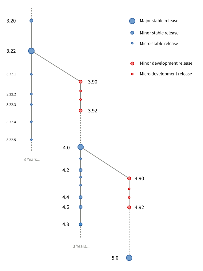
3.22 will be the last minor release of the 3.x series, with the new versioning scheme coming into effect with 3.90. The 3.22 release is irregular in the scheme, in that it is a long-term stable version but won’t receive further minor releases and doesn’t have a .0 version number. This is a necessary transition step.

What’s next

More details about these plans, including specifics for library developers and distribution packagers, will follow in subsequent blog posts. The GTK+ development blog will also continue to provide updates about technical changes in GTK+ itself, in order to provide information about which changes will arrive in each upcoming major release.

We’re excited about these plans and are hopeful that they will usher in a new era for GTK+, in which application authors can be more confident in our platform, while still allowing the rapid pace of development that we have seen during the 3.x series.

The plans set out in this post supersede those that were publicised after the Toronto GTK+ hackfest in June 2016.

Adwaita

Today, Jakub Steiner from the GNOME design team is going to talk about Adwaita, the default theme for GTK+; the tools that the designers can use to style GTK+; and how the toolkit changed to allow a better design workflow.

Adwaita is the user facing façade of GTK+. In the past GTK+ had no face; there was no properly defined look for the toolkit. Like many things in the FOSS world, it was a bring your own. There was Raleigh, a fallback skin that only showed up if something went sideways with theming or the system settings. And you didn’t really want to see that.

Adwaita

CSS

With GTK+ 3.0 a bold new effort has started. An effort to put visual designers in charge of visual design, using tools they understand. Instead of resorting to theme engines to draw unique controls, a styling engine used on the web has been chosen. The “everything is a box” CSS model applied to GTK+ rather well. It took a lot of effort, mainly on the shoulders of Benjamin Otte, who over the years managed to give us what we dreamed of: a CSS-like box model, allowing us to space elements/controls using padding, margins, borders and nifty features like minimum width. On the selector side, we aren’t dealing with the direct nested widget structure that changes from release to release, but we were given an abstracted, HTML-like DOM structure, with nodes and classes. Nodes are also consistently carrying state and are easier to animate.

SCSS

In GTK+ there are a lot of controls that look like a button but aren’t a button. Every programmer is on the lazy side, and that’s a good thing. Designers aren’t any different. It’s so positive that there is an acronym for it, DRY — don’t repeat yourself. So in the old Adwaita, when we designed the look of some things that all looked the same, we only had one block of properties and a ton of selectors — the targets of that look. Buttons, dropdowns, you name it. Not much typing, but insanity to alter.

SASS came to the rescue by providing means to define a common drawing procedure once, but reuse it in a well structured stylesheet. You would be able to draw things “like a button” but not define it as a button. You would still find a dropdown nicely semantically organized in a dropdown section. SASS calls these macros mixins and you will find our drawing ones in src/gtk/theme/Adwaita/_drawing.scss.

/* Switch Slider being a button */
slider {
/* ... */
@include button(normal, $edge: $shadow_color);
}
Inspector

A massive improvement for the designer’s workflow has been the introduction of the Inspector. The inspector is an invaluable tool to test out new style interactively or to figure out why a particular selector isn’t working. There are a couple of powerful tools it provides:

  • Widget selector. You can interactively point at a widget to learn about its properties or where it lives in the widget tree stack. Since 3.20 you can also learn about its CSS nodes, learn what sort of states it can get to, learn all the classes it has been assigned. It can also tell you where in the stylesheet the set property has been defined. This helps you figure out why your selector isn’t working. Somewhat. It would be real nice to see all matching selectors, even those that have been overriden by those that take precedence.
  • Interactive CSS stylesheet. You can write a CSS rule and have it applied in real time. This is not only useful to figure out a proper selector, but also experiment with drawing using GTK+ directly rather than using tools like Inkscape. Being able to iterate fast and try out things results in better design.

If this all sounds very similar to what modern browsers provide, it’s not much of a coincidence.

CSS Nodes in the Inspector
Future Improvements

A major factor that’s making us less flexible in terms of being able to alter Adwaita are the graphic assets. There are still a couple of things that we have to resort to using image assets for. Those are actually in a large asset sheet SVG and we have a bunch of scripts to chop up multiple sized images (for HiDPI). It remains a hassle to add or change a particular bit.

To make this a little less boring, here’s a little web demo of how we could possibly avoid using image assets to draw GtkScale sliders and use simple CSS boxes instead:

<div id="scale" class="scale">
  <div class="trough"></div>
  <div id="slider" class="slider run-animation"></div>
</div>

<style type="text/css">
.scale {
  position: relative;
  width: 100%;
  height: 64px;
}
.scale:hover { }
.trough {
  position: absolute;
  top: 50%;
  transform: translateY(-50%);
  height: 8px;
  border-style: solid;
  border-width: 2px;
  border-radius: 4px;
  left: 0; right: 0;
  border-color: #a7a7a7;
  background-color: #b1b3b1;
  background-image: linear-gradient(to bottom, #a7a7a7, #bebebe);
  box-shadow: 0 1px 0 rgba(255,255,255,0.8);
}
.slider {
  position: absolute;
  width: 48px; height: 48px;
  top: 50%;
  left: 0%;
  transform: translateY(-50%) translateX(0%) rotate(0deg);
  border-style: solid;
  border-width: 2px;
  border-color: #a7a7a7;
  border-radius: 0;
  background-color: #e0e0e0;
  background-image: linear-gradient(135deg, #ededed, #d3d3d3);
  box-shadow: inset 0 0 0 2px rgba(255,255,255,0.2),
              2px 2px 2px rgba(0,0,0,0.1);
}
.slider.run-animation {
  animation-name: morph, progress;
  animation-delay: 6s,10s;
  animation-duration: 3s,3s;
  animation-iteration-count:1,infinite;
  animation-direction: normal, alternate;
  animation-timing-function: ease-in-out;
  animation-fill-mode: forwards;
}
.slider.run-animation:hover {
  /* the best way to reset CSS animations is switching between identical keyframes */
  animation-name: morphClone, progressClone;
}
@keyframes morph {
  0% {
    border-radius: 0;
    transform: translateY(-50%) translateX(0%) rotate(0deg);
  }
  90% {
    border-radius: 50% 50% 0 50%;
    transform: translateY(-50%) translateX(0%) rotate(0deg);
  }
  100% {
    border-radius: 50% 50% 0 50%;
    transform: translateY(-60%) translateX(0%) rotate(45deg);
  }
}
@keyframes morphClone {
  0% {
    border-radius: 0;
    transform: translateY(-50%) translateX(0%) rotate(0deg);
  }
  90% {
    border-radius: 50% 50% 0 50%;
    transform: translateY(-50%) translateX(0%) rotate(0deg);
  }
  100% {
    border-radius: 50% 50% 0 50%;
    transform: translateY(-60%) translateX(0%) rotate(45deg);
  }
}
@keyframes progress {
  0% {
    left: 0%;
    transform: translateY(-60%) translateX(0%) rotate(45deg);
  }
  100% {
    left: 100%;
    transform: translateY(-60%) translateX(-100%) rotate(45deg);
  }
}
@keyframes progressClone {
  0% {
    left: 0%;
    transform: translateY(-60%) translateX(0%) rotate(45deg);
  }
  100% {
    left: 100%;
    transform: translateY(-60%) translateX(-100%) rotate(45deg);
  }
}
</style>

Essentially the slider is a box with 3 corners rounded and rotated by 45 degrees. All we need is boxes.

    /* transforms-based scale slider on the web */
.slider {
  position: absolute;
  width: 48px; height: 48px;
  top: 50%;
  left: 0%;
  /* move up slightly after rotation, thus not 50% */
  transform: translateY(-60%) rotate(45deg);
  border-style: solid;
  border-width: 2px;
  border-color: #a7a7a7;
  border-radius: 50% 50% 0 50%;
  background-color: #e0e0e0;
  background-image: linear-gradient(135deg, #ededed, #d3d3d3);
  box-shadow: inset 0 0 0 2px rgba(255,255,255,0.2),
              2px 2px 2px rgba(0,0,0,0.1);
}