Container secrets: size allocation

I recently had an opportunity to reimplement size allocation for a container with all the things that GTK+ supports:

  • RTL support
  • Natural size
  • Align and expand
  • Height-for-width
  • Orientation support
  • Baselines

If you do a one-off container in an application, most of these may not matter, but in a general-purpose GTK+ widget, all of them are likely to become relevant sooner or later.

Since this is quite a lot of ground to cover, it will take a few posts to get through this. Lets get started!

The starting point

GtkCenterBox is a simple widget that can contain three child widgets – it is not a GtkContainer, at least not currently. In GTK+ 4, any widget can be a parent of other widgets. The layout that GtkCenterBox applies to its children is to center the middle child, as long as that is possible.  This is functionality that GtkBox provides in GTK+ 3, but the center child handling complicates an already complex container. Therefore we are moving it into a separate widget in GTK+ 4.

Expanded
Natural size
Below natural size
Minimum size

When I started looking at the GtkCenterBox size allocation code, it was very simple. The two methods to look at are measure() and size_allocate().

The measure implementation was just measuring the three children, adding up the minimum and natural sizes in horizontal direction, and taking their maximum in vertical direction. In rough pseudo-code:

if (orientation == GTK_ORIENTATION_HORIZONTAL) {
  *minimum = child1_min + child2_min + child3_min;
  *natural = child1_nat + child2_nat + child3_nat;
} else {
  *minimum = MAX(child1_min, child2_min, child3_min);
  *natural = MAX(child1_min, child2_min, child3_min);
}

The size_allocate implementation was putting the first child to the left, the last child to the right, and then placed the middle child in the center, eliminating overlaps by pushing it to the right or left, as needed.

child1_width = child1_min;
child2_width = child2_min;
child3_width = child3_min;
child1_x = 0;
child3_x = total_width - child3_width;
child2_x = total_width/2 - child2_width/2;
if (child2_x < child1_x + child1_width)
  child2_2 = child1_x + child1_width;
else if (child2_x + child2_width > child3_x)
  child2_x = child3_x - child2_width;

As you can see, this is pretty straightforward. Sadly, it does not have any of the features I listed above:

  • Children always get their minimum size
  • The ::expand property is not taken into account
  • The first child is always placed at the left, regardless of text direction
  • No vertical orientation
  • No height-for-width support
  • Baselines are ignored

Over the next few posts, I’ll try to show how to add these features back, hopefully clarifying some of the mysteries of how GTK+ size allocation works, along the way.

References

  1. First commit in the series
  2. Documentation for GtkWidget size allocation
  3. The code that we start from

Drag-and-Drop in lists, revisited

My previous post on Drag-and-Drop in lists made some compromises in order to present the simplest, fully functional implementation. One of these was that we could only draw the drop target highlight around entire rows, whereas the drop really inserts the dropped row between rows. Lets try to do better!

Changing the target

In the simplified version, we made every row a drop target. This time around, we will change this and have just the list itself accept drops.

gtk_drag_dest_set (list,
                   GTK_DEST_DEFAULT_MOTION|GTK_DEST_DEFAULT_DROP, 
                   entries, 1,
                    GDK_ACTION_MOVE);
g_signal_connect (list, "drag-data-received",
                  G_CALLBACK (drag_data_received), NULL);

If you compare this to what was done before, you may notice another change: Instead of GTK_DEST_DEFAULT_ALL, we now just request the default behavior for motion and drop. We no longer request the default behavior for highlighting, since we want to handle that ourselves.

In order to do so, we need to connect to the drag-motion and drag-leave signals. These are emitted on the drop target, i.e. the list:

 g_signal_connect (list, "drag-motion",
                   G_CALLBACK (drag_motion), NULL);
 g_signal_connect (list, "drag-leave",
                   G_CALLBACK (drag_leave), NULL);

Mind the gap

The basic idea for our improved drag highlighting is that we keep track of the two adjacent rows between which the drop will happen, and use the GTK+ CSS machinery to create a suitable highlight of the gap.

This requires a bit too much code to show in full here, but the idea is as follows: Find the row that is currently under the cursor with gtk_list_box_get_row_at_y(). Look at its allocation to to find out if the cursor is in the top or bottom half of the row. Depending on that, we pick either the following or the preceding row as the other member for our pair of rows.

row = gtk_list_box_get_row_at_y (list, y);
gtk_widget_get_allocation (row, &alloc);
if (y < alloc.y + alloc.height/2)
  {
    row_after = row;
    row_before = get_row_before (list, row);
  }
else
  {
    row_before = row;
    row_after = get_row_after (list, row);
  }

There are some corner cases which I am omitting here, e.g. when the hovered row is the first or last row, or when we are hovering over ’empty space’ in the list.

CSS Highlights

I said we would be using CSS for creating the highlight. The easiest way to do so is to just add style classes to the two rows we’ve found:

gtk_style_context_add_class (
                      gtk_widget_get_style_context (row_before),
                      "drag-hover-bottom");
gtk_style_context_add_class (
                      gtk_widget_get_style_context (row_after),
                      "drag-hover-top");

And then we will use some custom CSS to create our highlight. In case you are wondering: #4e9a06 is the drag highlight color used in the Adwaita theme.

.row.drag-hover-top {
  border-top: 1px solid #4e9a06; 
}
.row.drag-hover-bottom {
  border-bottom: 1px solid #4e9a06; 
}

This is again omitting the corner cases that I’ve mentioned before.

How did we get here ?

Dropping the row onto the place it came from does not achieve anything. It makes sense to mark the place where the drag started in some way to make this obvious. We can again use CSS for this, and add a style class to the dragged row in our drag_begin() method:

gtk_style_context_add_class (gtk_widget_get_style_context (row),
                             "drag-row");

In order to give the row a bit a highlight when we are hovering over it, we add an extra style class to it in our drag_motion() handler:

if (row == drag_row)
  {
    gtk_style_context_add_class (gtk_widget_get_style_context (row),
                                 "drag-hover");
    row_before = get_row_before (row);
    row_after = get_row_after (row);
  }
else …

And here is the CSS for these classes:

.row.drag-row {
  color: gray;
  background: alpha(gray,0.2);
 }
 .row.drag-row.drag-hover {
  border-top: 1px solid #4e9a06;
  border-bottom: 1px solid #4e9a06;
  color: #4e9a06;
}

Putting it all together

(Sorry about the broken cursors. We should really fix this in gnome-shell’s screen recorder.)

References

  1. The complete example, testlist3.c
  2. The GTK+ DND documentation

Container secrets

I recently spent some time tracking down a problem with GTK+ containers and drawing. Here is what I found out.

CSS drawing

In GTK+ 3.22, most, if not all, containers support the full CSS drawing model with multiple layers of backgrounds and borders. This is how, for example, GtkFrame draws its frame nowadays. But also containers that normally only arrange their children, such as GtkBox, can draw backgrounds and borders. The possibilities are endless!

For example, we can use a GtkBox to put a frame around a list box and a label, to make the label visually appear as part of the list. You can even make it colorful and fun, using some CSS like:

box.frame {
 border: 5px solid magenta;
}

Allocation and resizing

Traditionally, most containers in GTK+ are not doing any drawing of their own and just arrange their children, and thus there is no real need for them to do a full redraw when their size changes – it is enough to redraw the children. This is what gtk_container_set_reallocate_redraws() is about. And it defaults to FALSE in GTK+ 3, since we did not want to risk adding excessive redraws  whenever allocations change.

You can see where this is going: If I use the delete button to remove Butter and Salt from the list of ingredients, the allocation of the list, and thus of the box around it, will shrink, and we get a redraw problem.

The solution

If you plan to make plain layout containers draw backgrounds or borders, make sure to set reallocate-redraws to TRUE for the right widgets (in this case, the parent of the fun box).

gtk_container_reallocate_redraws (GTK_CONTAINER (parent), TRUE);

Note that gtk_container_reallocate_redraws() is deprecated in GTK+ 3.22, since we will get rid of it in GTK+ 4 and do the right thing automatically. But that shouldn’t stop you from using it to fix this issue.

Another (and maybe better) alternative is to use a container that is meant to draw a border, such as GtkFrame.

Drag-and-drop in lists

I’ve recently had an occasion to implement reordering of a GtkListBox via drag-and-drop (DND). It was not that complicated. Since I haven’t seen drag-and-drop used much with list boxes, here is a quick summary of what is needed to get the basics working.

Setting up the drag source

There are two ways to make a GTK+ widget a drag source (i.e. a place where clicking and dragging will initiate a DND operation). You can decide dynamically to initiate a drag by calling gtk_drag_begin(). But we go for the simpler approach here: we just declare statically that our list rows should be drag sources, and let GTK+ handle all the details:

handle = gtk_event_box_new ();
gtk_container_add (GTK_CONTAINER (handle),
        gtk_image_new_from_icon_name ("open-menu-symbolic", 1));
gtk_drag_source_set (handle,
        GDK_BUTTON1_MASK, entries, 1, GDK_ACTION_MOVE);

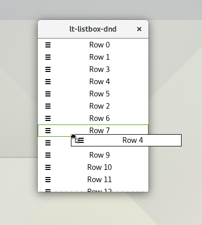
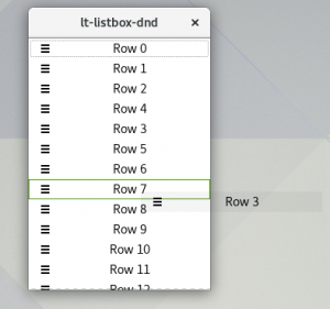
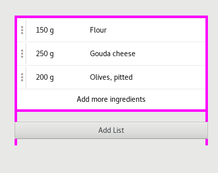
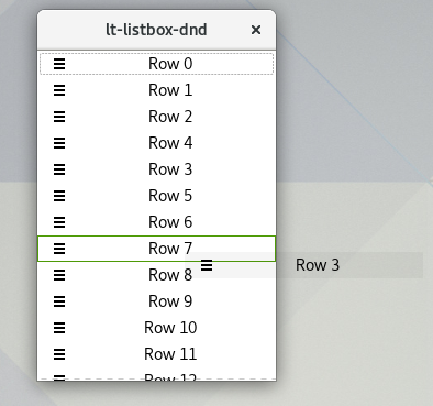
Note that I choose to create a visible drag handle here instead of allowing drags to start anywhere on the row. It looks like this:

The entries tell GTK+ what data we want to offer via drags from this source. In our case, we will not offer a standard mime type like text/plain, but instead make up our own, private type, and also hint GTK+ that we don’t want to support drags to other applications:

static GtkTargetEntry entries[] = {
   { "GTK_LIST_BOX_ROW", GTK_TARGET_SAME_APP, 0 }
};

A little gotcha here is that the widget you set up as drag source must have a GdkWindow. A GtkButton or a GtkEventBox (as in this example) will work. GTK4 will offer a different API to create drag sources that avoids the need for a window.

With this code in place, you can already drag your rows, but so far, there’s nowhere to drop them. Lets fix that.

Accepting drops

In contrast to drags, where we created a visible drag handle to give users a hint that drag-and-drop is supported, we want to just accept drops anywhere in the list. The easiest way to do that is to just make each row a drop target (i.e. a place that will potentially accept drops).

gtk_drag_dest_set (row,
        GTK_DEST_DEFAULT_ALL, entries, 1, GDK_ACTION_MOVE);

The entries are the same that we discussed above. GTK_DEST_DEFAULT_ALL tells GTK+ to handle all aspects of the DND operation for us, so we can keep this example simple.

Now we can start a drag on the handle, and we can drop it on some other row. But nothing happens after that. We need to do a little bit of extra work to make the reordering happen. Lets do that next.

Transferring the data

Drag-and-drop is often used to transfer data between applications. GTK+ uses a data holder object called GtkSelectionData for this. To send and receive data, we need to connect to signals on both the source and the target side:

g_signal_connect (handle, "drag-data-get",
        G_CALLBACK (drag_data_get), NULL);
g_signal_connect (row, "drag-data-received",
        G_CALLBACK (drag_data_received), NULL);

On the source side, the drag-data-get signal is emitted when GTK+ needs the data to send it to the drop target. In our case, the function will just put a pointer to the source widget in the selection data:

gtk_selection_data_set (selection_data,
        gdk_atom_intern_static_string ("GTK_LIST_BOX_ROW"),
        32,
        (const guchar *)&widget,
        sizeof (gpointer));

On the target side, drag-data-received is emitted on the drop target when GTK+ passes the data it received on to the application. In our case, we will pull the pointer out of the selection data, and reorder the row.

handle = *(gpointer*)gtk_selection_data_get_data (selection_data);
source = gtk_widget_get_ancestor (handle, GTK_TYPE_LIST_BOX_ROW);

if (source == target)
  return;

source_list = gtk_widget_get_parent (source);
target_list = gtk_widget_get_parent (target);
position = gtk_list_box_row_get_index (GTK_LIST_BOX_ROW (target));

g_object_ref (source);
gtk_container_remove (GTK_CONTAINER (source_list), source);
gtk_list_box_insert (GTK_LIST_BOX (target_list), source, position);
g_object_unref (source);

The only trick here is that we need to take a reference on the widget before removing it from its parent container, to prevent it from getting finalized.

And with this, we have reorderable rows. Yay!

As a final step, lets make it look good.

A nice drag icon

So far, during the drag, you just see just the cursor, which is not very helpful and not very pretty. The expected behavior is to drag a visual representation of the row.

To make that happen, we connect to the drag-begin signal on the drag source:

g_signal_connect (handle, "drag-begin",
        G_CALLBACK (drag_begin), NULL);

…and do some extra work to create a nice ‘drag icon’:

row = gtk_widget_get_ancestor (widget, GTK_TYPE_LIST_BOX_ROW);
gtk_widget_get_allocation (row, &alloc);
surface = cairo_image_surface_create (CAIRO_FORMAT_ARGB32,
                                      alloc.width, alloc.height);
cr = cairo_create (surface);
gtk_widget_draw (row, cr);

gtk_drag_set_icon_surface (context, surface);

cairo_destroy (cr);
cairo_surface_destroy (surface);

This looks more complicated than it is – we are creating a cairo surface of the right size, render the row widget to it (the signal is emitted on the handle, so we have to find the row as an ancestor).

Unfortunately, this does not yet yield a perfect result, since list box rows generally don’t render a background or frame. To work around that, we can temporarily add a custom style class to the row’s style context, and use some custom CSS to ensure we get a background and frame:

context = gtk_widget_get_style_context (row);
gtk_style_context_add_class (context, "drag-icon");
gtk_widget_draw (row, cr);
gtk_style_context_remove_class (context, "drag-icon")

As an extra refinement, we can set an offset on the surface, to prevent a visual ‘jump’ at the beginning of the drag, by placing this code before the gtk_drag_set_icon_surface() call:

gtk_widget_translate_coordinates (widget, row, 0, 0, &x, &y);
cairo_surface_set_device_offset (surface, -x, -y);
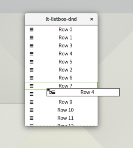

Voila!

Next steps

This article just shows the simplest possible setup for row reordering by drag-and-drop. Many refinements are possible, some easy and some not so easy.

An obvious enhancement is to allow dragging between different lists in the same application. This is just a matter of being careful about the handling of the list widgets in the drag_data_received() call, and the code I have shown here should already work for this.

Another refinement would be to drop the row before or after the target row, depending on which edge is closer. Together with this, you probably want to modify the drop target highlighing to indicate the edge where the drop will happen. This could be done in different ways, but all of them will require listening to drag-motion events and juggling event coordinates, which is not something I wanted to get into here.

Finally, scrolling the list during the drag. This is important for long lists, if you want to drag a row from the top to bottom – if the list doesn’t scroll, you have to do this in page increments, which is just too cumbersome. Implementing this may be easiest by moving the drag target to be the list widget itself, instead of the individual rows.

References

The GTK+ Inspector

Many GTK+ users and developers have already heard of the GTK+ Inspector, a tool to inspect, modify and understand GTK+ applications. The Inspector is extremely powerful, and allows theme designers to test CSS changes on-the-fly and magnify widgets to see even the smallest details, lets developers check the application widgets and their properties, and lets users to play (and eventually break) applications.

In this article, we’ll explore the GTK+ Inspector and show what can you do with it.

Prelude

Since the Inspector is a debugging tool, it is disabled by default. To start using the Inspector, you first have to enable it. You can easily do that with DConf Editor:

Enabling the Gtk+ Inspector with DConf Editor
Enabling the GTK+ Inspector with DConf Editor

Alternatively, you can use the terminal to enable it. To do that, run the following command:

$ gsettings set org.gtk.Settings.Debug enable-inspector-keybinding true

Done! The Inspector is now enabled!

Opening the Inspector

Now that the Inspector is enabled, you want to run it. The Inspector is always associated with an application. Let’s use GNOME Calendar for example:

GNOME Calendar
The GNOME Calendar application

There are multiple ways to bring up the Inspector. You can open it while using the application, by typing <Ctrl> + <Shift> + D (or <Ctrl> + <Shift> + I to automatically select the widget under the mouse pointer). Alternatively, you can launch the application from the terminal with the environment variable GTK_DEBUG=interactive.

The Inspector will open, and you’ll see the following window:

Inspector on Calendar
The Inspector window over GNOME Calendar

And that’s all you have to do. Now let’s explore the various functions that the Inspector has to offer.

Exploring the Inspector

At first, the overwhelming number of buttons and tabs can confuse those who are not well-versed in the art of inspecting applications. A quick explanation of the tabs, in order:

  • Objects: exposes the widgets of the application, and allows editing properties and seeing detailed information about each widget. Explained below.
  • Statistics: shows miscellaneous statistics of the application. You need to run the application with GOBJECT_DEBUG=instance-count.
  • Resources: shows the various resources that are embedded in the application binary, such as custom icons or GtkBuilder files, among others.
  • CSS: allows testing CSS live. Explained below.
  • Visual: controls some visual aspects of the application, such as the text direction, dark/light variant, the theme, the scaling factor, etc.
  • General: shows miscellaneous information about the GTK+ application (and the session it is running in).

Let’s dissect the main window of the GTK+ Inspector:

Inspector window
The main Inspector window

Those 4 annotated sections of the Inspector are the most commonly used ones. Theme designers will want to check (3) and (4), while developers usually use (1) and (2).

Inspecting widgets

For developers, the Inspector shows its usefulness by letting you change the properties of any widget on the screen. Let’s start by clicking the first button and selecting a widget using the mouse cursor:

Selecting widgets
Selecting a widget with the Inspector

You can now easily change the properties of that widget by browsing the Objects > Properties tab. You can change, for example, the visibility of a widget, the text of a label, and much more!

Editing a widget property

Now that you know how to inspect a GTK+ application, play around and explore how many applications are organized. Change the widgets’ properties and see what happens. Most of the times, this is safe and won’t break your GNOME session, or freeze your computer!

Editing CSS

The Inspector is a powerful tool for designers too. One of the greatest features it has is the live CSS editor. Let’s start by going to the CSS tab:

CSS Editor
The Inspector CSS Editor view

Let’s play with CSS! Paste the following CSS code and see what happens:

window stack {
    background-color: orange;
}

Whoa! The window became alien! That CSS code changes the background color of any GtkStack widget inside a GtkWindow. If you want to learn more about CSS selectors and how GTK+ is using CSS for theming, there are some useful links at the end of this article.

The cautious reader may ask: what is the hierarchy of CSS elements? How can I see which CSS elements are available?

Fear not! GTK+ Inspector allows you to easily check the CSS hierarchy at the Objects > CSS Nodes tab.

CSS Nodes
The CSS Nodes tab

GTK+ widgets have documented CSS names. You can browse the GTK+ documentation to see how widgets are organized, and how you can use CSS to control the various aspects of the widgets.

Not sure if your CSS changes are perfect? Let’s magnify the widget to make sure we don’t miss any detail:

Zooming widget using Magnifier
Zooming a widget using the Magnifier tab

Looking good? Join -design and share your awsome CSS snipplets with the community!

Wrapping up

While this article explores some of the biggest aspects of the GTK+ Inspector, this is by far not an exhaustive list of all the features of the Inspector. After reading this article, however, you’ll hopefully be able to open the Inspector and explore more of its awesome power on your own.

Doubts? Comments? Suggestions? Stop by and leave a comment, join #gtk+ channel at the GNOME IRC network and let us know what you think!

Useful Links