Adwaita has been the default GTK+ theme for quite a while now (on all platforms). It has served us well, but Adwaita hasn’t seen major updates in some time, and there is a desire to give it a refresh.
Updating Adwaita is a challenge, since most GTK applications are using the stable 3.x series, and some of them include Adwaita-compatible theming for their own custom widgets. Given the stable nature of this release series, we don’t want to cause theme compatibility issues for applications. At the same time, 3.x is the main GTK version in use today, and we want to ensure that GTK applications don’t feel stale or old fashioned.
A trial
A number of approaches to this problem have been considered and discussed. Out of these, a tentative plan has been put forward to trial a limited set of theme changes, with the possibility of including them in a future GTK 3 release.
Our hope is that, due to the limited nature of the theme changes, they shouldn’t cause issues for applications. However, we don’t want to put our faith in hope alone. Therefore, the next three weeks are being designated as a testing and consultation period, and if things go well, we hope to merge the theme into the GTK 3.24.4 release.
It should be emphasised that these changes are confined to Adwaita itself. GTK’s CSS selectors and classes have not been changed since GTK 3.22, and the changes in Adwaita won’t impact other GTK themes.
The Adwaita updated theme is being made available as a separate tarball in parallel with the GTK 3.24.3 release, and can be downloaded here. GTK application developers are invited to try 3.24.3 along with the new version of Adwaita, and report any issues that they encounter. The GTK team and Adwaita authors will also be conducting their own tests. Details of how to test the new theme in various ways are described here.
We are hoping to strike a balance between GTK’s stability promises on the one hand, and the desire to provide up-to-date applications on the other. It is a delicate balance to get right and we are keen to engage with GTK users as part of this process!
Theme changes
The rest of this post summarises which changes are have been made to the theme. This will hopefully demonstrate the limited extent of these changes. It will also help developers know what to look for when testing.
Colors
Many of the Adwaita colors have been very slightly tweaked. The new colors are more vivid than the previous versions, and so give Adwaita more energy and vibrancy. The new colors also form part of a more extensive palette, which is being used for application icons. These colours can also be used in custom application styling.
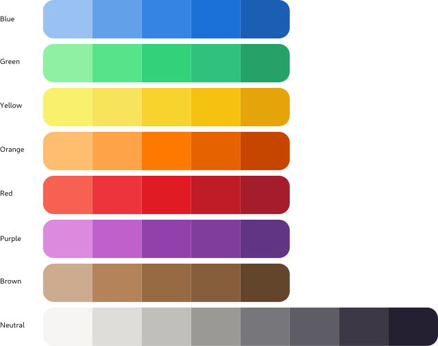
The color changes are subtle, so any compatibility issues between the new and the old versions should not be serious. Blue is still blue (just a slightly different shade!) Red is still red. Visually, the dark and light versions of the theme remain largely the same.
Adwaita’s dark variant, showing the slight color changes between old (left) and new (right).
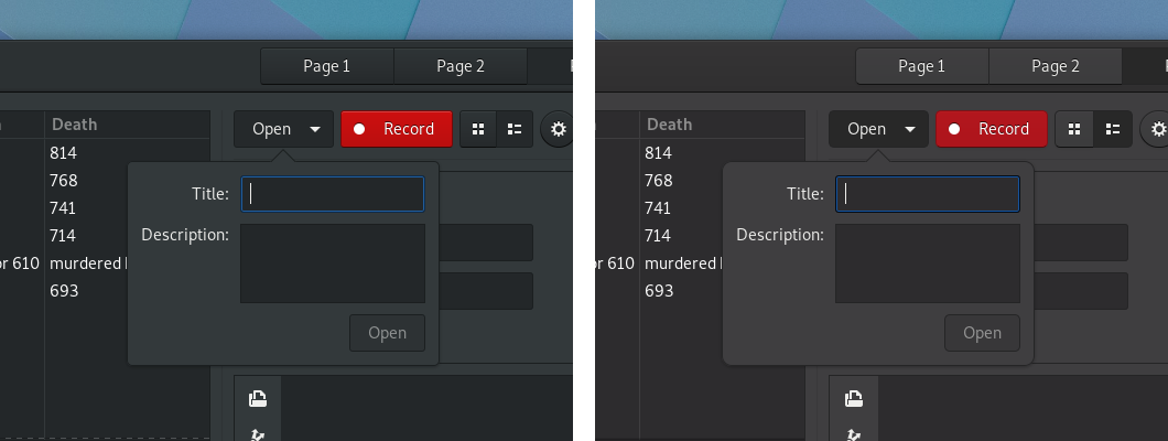 Note that the red of the button has been toned down a bit in the dark theme.
Header bars and buttons
Most widgets have not been specifically changed in the updated version of Adwaita. However, two places where there are widget-specific changes are header bars and buttons. In both cases, an effort has been made to be lighter and more elegant.
Buttons have had their solid borders replaced with shadows. Their background is also flatter and their corners are more rounded. Their shape has also been changed very slightly.
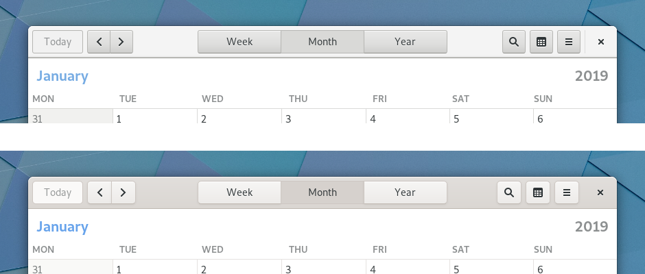
Header bars have been updated to complement the button changes. This has primarily been done by darkening their background, in order to give buttons sufficient contrast. The contrast between header bars’ focused and unfocused states has also been increased. This makes it easier for users to identify the focused window.
At first glance, these changes are some of the most significant, but they are achieved with some quite minor code changes.
The header bar in GNOME’s Calendar app (old version on top, new version on the bottom):
Switches
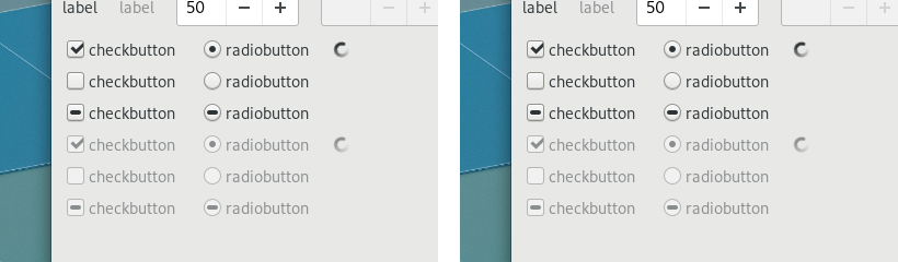
Aside from header bars and buttons, the only other widget to be changed is switches. When GTK first introduced switches, they were a fairly new concept on the desktop. For this reason, they included explicit “ON” and “OFF” labels, in order to communicate how the switches operated. Since then, switch widgets have become ubiquitous, and users have become familiar with switches that don’t contain labels.
The latest Adwaita changes bring the theme into line with other platforms and make switches more compact and modern in appearance, by removing the labels and introducing a more rounded shape.
Elsewhere, no change
Aside from the changes described above, very little has changed in Adwaita. The vast majority of widgets remain the same, albeit with very slightly altered colours. Generally, UI layouts shouldn’t alter and users should feel comfortable with the changes.
Spot the difference (the old version of Adwaita is on the left and the new version is on the right):
Conclusion
Please try the new theme. We hope you like it!
And we appreciate your feedback—in particular if you are a GTK application developer. You can provide it on irc (in the #gtk+ channel on GimpNet) or via the gtk-devel-list mailing list, or by filing an issue in gitlab.
Thanks for the blog entry on Theme changes in GTK 3. I am looking forward to some changes in Adwaita. I would like to encourage one particular change:
LibreOffice now supports GTK3 and it overall looks nice. However, if you open LibreOffice Writer, you see that LibreOffice with Adwaita has very big and too wide buttons. I mean those selector buttons with the icon “▼” right of the font list or right of the styles list. With Adwaita, they just look too big.
I hope you have the time to look at the styling of this particular button type. I would be happy if you make LibreOffice with Adwaita looking nicer.
Very nice. The new theme looks fresh!
I have only one concern: on your screenshot that shows the Calendar app, the “Month” button on the old theme is very clearly in the “pressed” state, however on the new theme it doesn’t look “pressed”, instead it looks “disabled”. I’d suggest to slightly change the grey background and maybe slightly increase the inner shadow so that the button clearly looks “pressed” and not “disabled”.
I agree, my biggest qualm with Adwaita is how large the padding is for widgets and headerbars.
I would hope they had a way to detect the type of machine and make them smaller if a mouse is detected. Or even just shrink the padding a little bit on lower-dpi displays.
I currently use Arc-theme because it has smaller padding and a lot of these theme changes already implemented.
It looks really nice! Thanks for good work.
The only small thing I can think of that could be improved is in the header bar. In calendar app, the selected button (“Month”) is a bit too similar to the background color. It ceases to be distinguishable as UI element and blends too much into the background. I could think that this is not a button but some kind of label between two buttons.
It’s awesome!
But I’m use other theme by default, because Adwaita have too large padding headerbar, widgets, etc (I use a notebook) .
I hope in the future Adwaita will get distinct compact version.
I like the new more brownish feel of the dark version
I’m not looking forward to this at all. I’m a fan of GNOME and like Adwaita as it is. It’s already perfect to me.
This new theme looks like a downgrade at best, and at worst harms accessibility by making it harder to differentiate UI elements. In the headerbar comparison, the current (top) “Month” button is clearly a pressed, selected button – while in the new (bottom) version it almost completely blends in with the headerbar and just looks like the title of the window, with unrelated buttons on the left and right of it.
The borders of the buttons are harder to make out on the new version as well. It all just blends into each other and looks blurry, fuzzy, and messy.
[WORDPRESS HASHCASH] The poster sent us ‘0 which is not a hashcash value.
Personally, I still find those toggle switches confusing on other platforms and have difficulty telling whether they’re on or off. So I’ve always really appreciated GNOME’s text labels and thought that was the perfect way to do it. Now I see you’re “bringing it in line with other platforms” and making it just as bad and confusing. Great…
I do agree with Vincen’t comment about the “Month” button becoming hard to distiguish from the background. The contrast created with the other buttons all being a lighter color than the background is interesting, but for that “pressed down / selected” button, it got worse. a simple adjustment there to bring up contrast would make it more visible.
with regards to the change in brightness of colours, I’m only judging from the screenshots but I do thing the brighter red and blue elements in the “old” theme were easier to distinguish from the background. since the background is very dark, elements that should be easy to spot in the interface should have as much contrast with the background as possible.
Please try the theme for a while on your desktop.
I’m a bit confused; in the Colors section it states: “The new colors are more vivid than the previous versions, and so give Adwaita more energy and vibrancy.” But in the screenshot for the Dark theme, the red is clearly duller than before.
First:
Congratulations with the new theme! It looks very nice and I’m looking forward to it!
I agree with most of the things that are said here. I only have one addition:
In the first screenshot, with the dark theme, the text on the button (‘Open’) is a bit difficult to read. I think you have to make the text a little bit whiter.
Keep up with the good work :-)! And thanks a lot!
great job!
simple, clear and keep UI modern and with a good experience!
I like the header bar’s new style, but not the color scheme because it looks much much more like plastics than the old one.
I like Adwaita very much because it is the least disturbing theme for me. Most changes seem a bit arbitrary to me though. The new brownish tint on Adwaita Dark is too much for me and the biggest issue. I was very happy when I found Adwaita Dark because it didn’t have ANY noticeable tint, at least to me. Adapta for example looks nice but it has a greenish tint that hurts in the eyes after two hours. Also the new theme lacks clarity, one of Adwaita’s strong points (pressed button or disabled option?). Please, don’t get me wrong. I am in favor of a subtle and good redesign but this I’m not very happy with.
@ Elliott S : “more energy and vibrancy.” depends on the calibration of your monitor and the surrounding lighting. On some monitors, the old red may have been washed out/too bright, and the new red more saturated (more chroma); one others, the old red was fine, and the new red is too dark. (Screens look slightly different with every generation, from CRT, to TN LCD, to IPS LCD, to OLED, etc. With every change comes a redesign; at least the process is stabilizing.)
Not too excited about the new on/off swithes; why are they round now when everything else is still pretty much square? I didn’t mind the labels at all; as others have said, it’s sometimes not clear whether a switch is in the on or off state – would pressing on make the switch go on or has it already been switched on.
I think the header should use #D2D2D2 as background color.
Looks positive to me :)
I didn’t mind most of the changes but the lack of contrast in the Calendar active center button I dislike greatly.
https://blog.gtk.org/files/2019/01/headerbars.png
It’s not distinct enough to be easily identifiable as a separate UI element with a function.
This looks quite good overall. However, buttons in some places seem to be missing shadows, which results in really low contrast. This is notable in Tweaks.
While the new dark theme tone is an improvement, the dark theme really isn’t dark enough! I think it should be even darker than the old Adwaita-dark. Right now it looks a quite bit lighter.
You guys should work on a more compact Adwaita theme for folks with smaller screens. I like Adwaita, but have never used it, since all widgets are huge and waste so much screen on a laptop…
Some still use a desktop with a mouse and don’t have touchscreens. Please remove the padding and make a compact version that is meant for something more effective than a cellphone.
Window header bars are too thick. People have been saying this for years, I don’t know why the developers keep ignoring the only user base they have – desktops.
System tray being on the top must be followed by light headrers, if you had system tray on the bottom you could get away with this kind of design.
Thank god Firefox updated so we don’t have to look at that abomination anymore.
Great job! I’ll switch to new Adwaita immediately =)
Theme contains many “gray” colors wich “almost gray but not exactly gray”. I replaced all that colors with their true gray equivalent (saturation to 0 in HSL): https://drive.google.com/drive/folders/1ffr0lnUy4eW6TauQQxCTF5FiXh-VeZ3p
IMHO it would be better for photo\video editing software: If GTK will have neutral theme without any warm\cold backgrounds which pretend to be gray.
New colors are good, but the old header button style is far better than the new one.
I agree with the comments of Timur and Vincent about the “Month” button… the previous version is very clearly a button in a selected state, whereas in the new version, it’s not obvious that it’s a button at all.
To a lesser extent, that also applies to the other header-bar buttons… it’s obvious from context that they’re intended to be buttons, but the new styling doesn’t really convey that impression… they don’t actually look like something you’d click on. I think that removing the gradients and the solid borders is a mistake there…
More positively, I do like the colour changes for the dark theme (header buttons aside)… I’ve always found light-on-dark text harder to read, and while it’s hard to tell from a small screenshot, the new warmer tones do look more comfortable to me.
I really like the new theme, because it’s flatter.
Great ++
Very nice
You can test adwaita changes with my daily build packages:
https://copr.fedorainfracloud.org/coprs/gnumdk/packages/builds/
I make Loren Dias words mine. I can see better the calendar buttons as buttons when they are not “flat”. (I hope there will be a toggle button between the flat/non-flat look).
As many others have pointed out, the active button on the Calendar app seams “disabled” and the contrast is too low as there is no frame now. It`s somewhat fine on my calibrated “RGB Full” monitor but it`s impossible to tell there is a button there on a normal laptop screen. Maybe the opacity of the shadow needs to be increased?
Also I liked the separator between the close button and the rest of the widgets in the header bar.
The changes look nice
I find the comment
”
We are hoping to strike a balance between GTK’s stability promises on the one hand, and the desire to provide up-to-date applications on the other.
”
somewhat concerning. Striking a balance between a promise and something else generally imply walking away from the promise. A major issue for gtk-3 has been the lack of stability, but this has greatly improved in the last few years.
Can you perhaps have an API for letting applications opt into theme updates? If an app doesn’t explicitly ask for the latest theme, it should probably get the promised “stable” theme.
its Beautiful!! But i think the buttons are too big. I have a 768p monitor and the window title becomes huge. would be nice if you release a compact version of the theme, saving more pixel that make a incredible difference in small screens like mine.
In Nautilus 3.30 headerbar, the folders buttons are too close of the slashes.
Definitely a downgrade.
I share @Chris and @Steve opinion on accessibility. I find borders necessary for accessibility and good usage in all configurations; instead of making them wider or more marked, we remove them for shadows, lol.
I find those headerbars a slap across the face, especially the gradient.
I do not like the increased roundness, too: roundness does not couple well with text labels. One should reduce buttons’ font label (reducing accessibility) or change font to get this roundness working.
As @colorspacehead says, theme rendering depends much on screen configuration and definitely this new theme renders well only on a subset of those Adwaita works on.
Overall it seems like one of those cheap Mac OS clone you can find on gnome-looks, not something that came out of the enlightened minds that made Clearlooks and Adwaita.
Even greybird is better than this, lol.
If you ask me, GNOME already has a visual style branding and that’s Adwaita: GTK apps on windows and mac os are perfectly reconnaisable and they are uniform on every platform.
With that theme GTK apps on mac are like xwidgets on gnome desktops.
I sincerely hope that even when the likeliness of all uninformed people will (certainly) approve this mess (or otherwise why bad taste is always on top of gnome-look.org charts?), you will know better and mantain both the Adwaita we enjoyed for the last five and more years and then whatever you like we have preinstalled.
In any case this is absolutely alpha software. I have found three visual bugs in nautilus only. Color incoherences are everywhere, though. Definitely not ready for this release.
In general, I do not think it is appropriate to have such a radical mandatory theme change in the last version of the 3.x cycle.
You would force all those who want to stay on the 3.x stable branch until 4.x API stability to bear this unwanted change.
Couple this mandatory change with that absurd ranting about how GNOME should not support theming that Allan made the other month (if there are no good themes out there is because there aren’t teams big enough to mantain those) and you will surely make an enemy of most users.
In the picture of the calendar, we see three buttons in a row, which belong to the same set. Before, there was a common border connecting them. In the new version, this border is lighter and the focused button disappears into the background, making the three buttons lose the connection between them.
What I see in the old version: three buttons for “Week-(Month)-Year”
What I see in the new version: a button for “Week”, a non-clickable title “Month”, and another button “Year”
Some people compare the new version to macOS. There, the respective button has a much darker background, making it clear that there is a different element there.
New theme looks great, small changes make a large difference.
On a related note, can Adwaita be updated to provide mouse-over/hover effects for inactive (i.e. non-focused) windows? Currently if you hover over a button on an inactive window nothing happens, making it feel like if you press the mouse button there nothing would happen. But, the mouse click does go to the app, and so the button would be clicked. Some widgets already respond to hover events for unfocused windows, e..g overlay scrollbars appear. The current Ubuntu theme (Yaru) implements this, for the reasons explained here.
A few issues I have with AdwaitaNew in Nautilus…
– There is now a border around the current folder in the path bar, the one with the triangle and the menu. I don’t like that in general but it also touches the /-divider if there are multiple items in the path bar, which doesn’t look right. And it gets really weird if you open the menu because opening that menu toggles between having this border and not having it.
– When having a wide Nautilus window (e.g. fullscreen) the path bar and the search button move to the middle. That looked OK in 3.30 with the default theme, when there was a wide border around the whole path bar and the search button was directly next to it. Now you have the path bar and the search button hanging somewhere and three gaps of different sizes. I’d suggest to bring back the wide border around the whole path bar or to keep the search button on the right side with the other buttons.
– If I set Nautilus to ‘list-view’ the files area is white and the sidebar is slightly gray but if it is set to ‘icon-view’ the files area is also gray and I would prefer it to be white.
…and the new switches:
– On my system they still have text labels in them which doesn’t work with the smaller switches
– I might agree with PhilipPirrip on the shape of the switches. Everything is more or less square, so it might be better to have square switches, even though I won’t miss the on/off-labels.
Otherwise my impression of this theme is positive, even though from a strictly aesthetic standpoint I might prefer the neutral grays in Andrey Shs screenshots. This is a step forward.
For some people, having ON and OFF labels in switches makes them more clear and usable. I think that the switches in ARC theme, which uses check and X marks and are just the perfect balance between compactness, abstraction and usability.
Amazing! I’m very happy to see the Gnome / GTK community finally moving to give a more modern look to the system and I’m even happier to see that these changes are beautiful and don’t take away the essence of the project. Congratulations!
I am agree with the commenter “Chris” and “Steve”:
“This new theme looks like a downgrade at best, and at worst harms accessibility by making it harder to differentiate UI elements.”
“I still find those toggle switches confusing on other platforms and have difficulty telling whether they’re on or off. So I’ve always really appreciated GNOME’s text labels and thought that was the perfect way to do it.”
This changes are really *bullshit* and makes GNOME ugly!! specially the old color scheme is significantly looks great and modern, who told you that this changes in colors are modern and the current theme is *old-fashioned*?! WTF??!!
Please open your ears!! and listen to our feedback!!
I also agree with most of the changes but absolutly hate the new headerbar and its button style. Gnome has a very good looking, minimal and pixel perfect theme. The new headerbar does not integrate into this theme and makes Gnome look like a 1:1 MacOs clone. It does not only lack contrast for the active “Month” button state, but also lacks contrast between button borders and background. Also the brownish tint may look nice on the picture but adds another color and will look horrible in applications such as nautilus where the sidebar icons are grey. Gnome Desktop was one of the reasons I switched to Fedora, I hope you do not ruin it :(
How do I get the dark version of this theme?
Ignore the previous question. I figured it out. Thanks.
About the new header bar as seen on Calender application, the disabled status is highlighted on the “today” button as the text is also greyed out. The Month is selected as intended.
I used this for the last couple of days and I must say I like it very much. There are a few things that currently look a bit off, though:
– As already mentioned above, activated button in headerbars do not really stand out. Their color is too similar to the background. This is especially obvious with the calendar selection for week, month and year.
– For me the on / off symbols on switches are displaced, they are not vertically centered as in your screenshots
– While I personally like the change to the switches, I can see how some people are not familiar with the current symbols. I think those symbols where more common in the past, but modern devices often don’t make use of them. SO maybe going back to text would be better. Just for me the position and color would be sufficient, but user feedback clearly shows it is not in many cases.
Any chance that the SpinButtons can be made smaller? Or an option that they need less space? I usually stack several of them horizontally and this requires much more space than in the 2.X days.
Most of these changes looks good to me, but I agree with other users that the pressed/activated ‘Month’ button could need some more contrast. Even for me with perfect sighting it somewhat looks like there’s a gap in there, for people with visual impairments it will be impossible to differentiate it. Would suggest using one of the darker shades from ‘neutral’ for pressed buttons, IF it becomes too dark (i have not tested it with the pallete) it might be worth considering switching the textcolor to a white-ish color when the button is pressed. Mostly everything else looks very nice imo, and congrats with a refined theme! <3
While I like the new theme, I would also like to see it in the dark gray as the old Adwaita theme.